
Rebranding Birmingham: What Would Happen If the City Had a Creative Director?
Creative/Art Directors in crime…
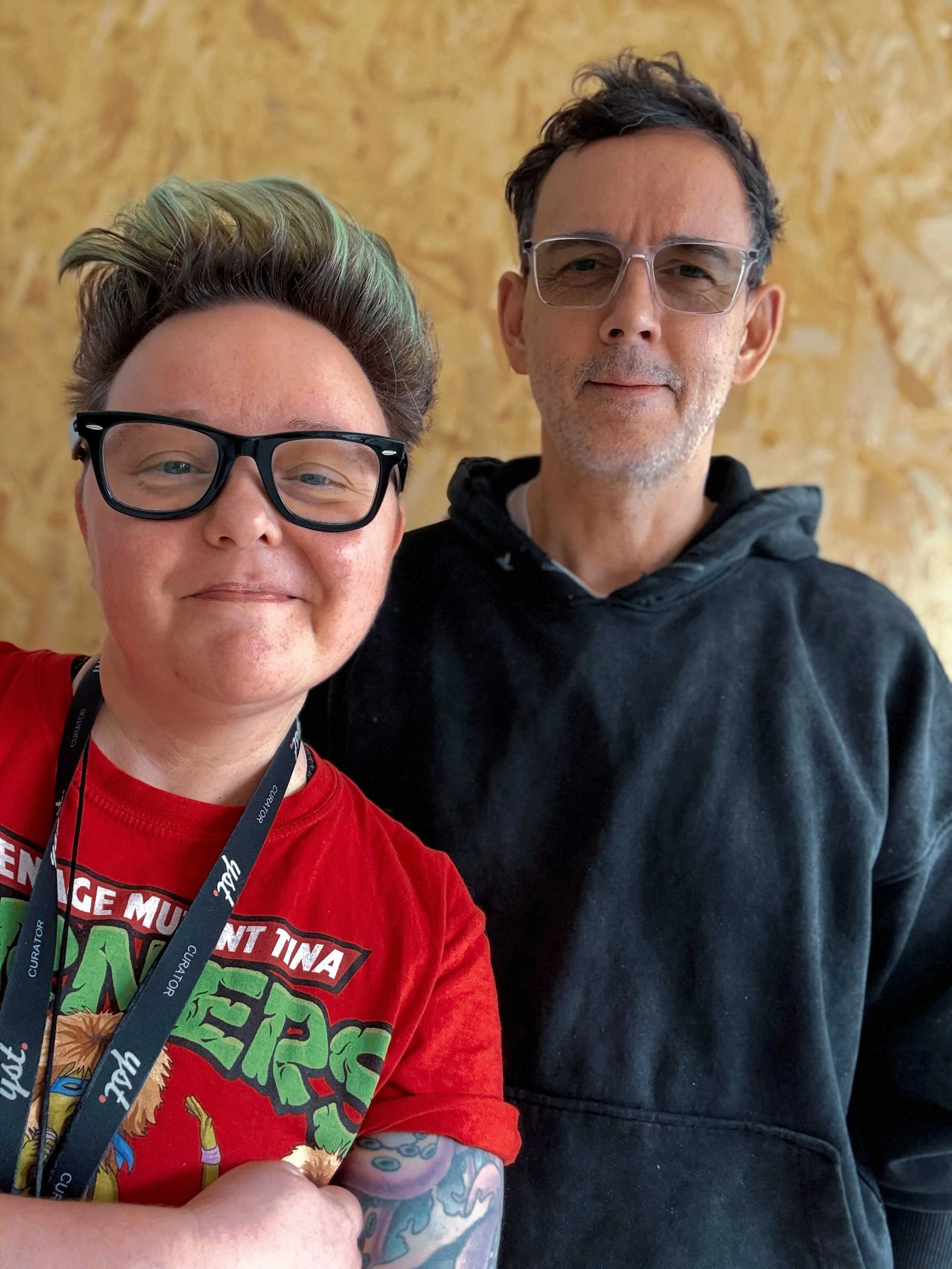
Studio Notes from YST (Damian Howell & Emma Woolley)
You’ve got grit, you’ve got history, you’ve got the best people, the best food, the best accent. But visually? Tonally? Brand-wise?
You’re chaos. And not in a good way.
So… what would happen if Birmingham had a Creative Director? Or two? Let’s say it’s us. Emma Woolley and Damian Howell.
YST Studios. Custard Factory. Steaming in — paintbrush in one hand, Figma board in the other.
Here’s what we’d do.
First things first: Let’s kill the tagline
Right now we’ve got “Birmingham: Every city should have one.”
Come again?
That’s not a brand. That’s what you say about a tin opener.
We’d replace it with something that actually means something.
Something that speaks to the creative energy, the layered identity, the humour and humility of the place.
Maybe:
Birmingham: Make it Make Sense
Birmingham: Built, Broken, Brilliant
Birmingham: Never Quite Polished
Birmingham: City of Soft Power
Birmingham: Shut Up, We’re Thinking
Or maybe we’d crowdsource it from Brummies on the Number 11.

Visual identity: bin the beige
Every creative director’s first job: kill the bland.
Right now Birmingham’s visual identity is split across three decades. It’s 90s WordArt meets 2012 Olympics, with a side of default blue gradients.
New rules if we’re in charge:
NO MORE SEAGULL LOGOS
NO COUNCIL BLUE
BAN PHOTOS OF THE LIBRARY TAKEN FROM THE SAME SPOT ON THE BRIDGE
We’d bring in fresh typography rooted in Brum’s industrial past. Think letterpress meets digital. Steel meets neon. A visual language that nods to history but feels future-focused.
Colour palette? Warm neutrals with shocks of hi-vis orange. Or black and gold. Or whatever we feel like - but it won’t be beige.

Tone of voice: stop trying to sound like a brochure
Every message from the city sounds like it was written by someone desperately trying to get out of a parking fine.
We’d rewrite everything. Clear, bold, honest. With rhythm. With pride. With jokes. With the occasional Brummie vowel thrown in for good measure.
Instead of:
“Welcome to Birmingham, a city of opportunity where diversity and innovation flourish.”
We’d go with:
“This city’s a bit mad. But it works. Mostly. Grab a chair, have a mooch, see what you think.”
Wayfinding: because even we get lost in Grand Central
We’d overhaul the signage. No more Helvetica on stretched vinyl.
Imagine signs you want to follow.
Colour-coded by zone. Clear routes. Local voice. Visual wit.
"You’re in Digbeth. You’re not lost. You’re just early."
"Walk this way for something decent."
"Buses this way. Courage that way."
Iconography: embrace the weird
Bullring bull? Bit scary. Spaghetti Junction? Weirdly lovable. The Floozie? She deserves better.
We’d reframe the icons. Celebrate the overlooked stuff - underpasses, chip shops, Brutalist blocks, old yellow buses, the accent.
And yes, we’d build a 20-foot sculpture of a pork scratching. You’re welcome.

The Ringway Centre by James A Roberts (1962)
Voice of the city: human first, policy second
A city brand is only as strong as its people. If it feels top-down and clinical, it fails.
Our job as creative directors wouldn’t be to control Birmingham. It would be to listen to it. Build a brand that can flex. A system that can be remixed by artists, businesses, schools, and weirdos.
Emma would lead on the visuals — colour, composition, form, rhythm.
Damian would steer the story — narrative, tone, structure, messaging.
Together? We’d design Birmingham like we design everything:
With guts. With humour. With humanity.
What would happen if Birmingham had a Creative Director?
It’d still be chaotic. Still be layered. Still be unpredictable.
But it would know itself.
And it would show up with pride.
Want your business to feel as bold as Brum could be?
Drop us a line. We’ll bring biscuits, moodboards, and a whole lot of ideas.