
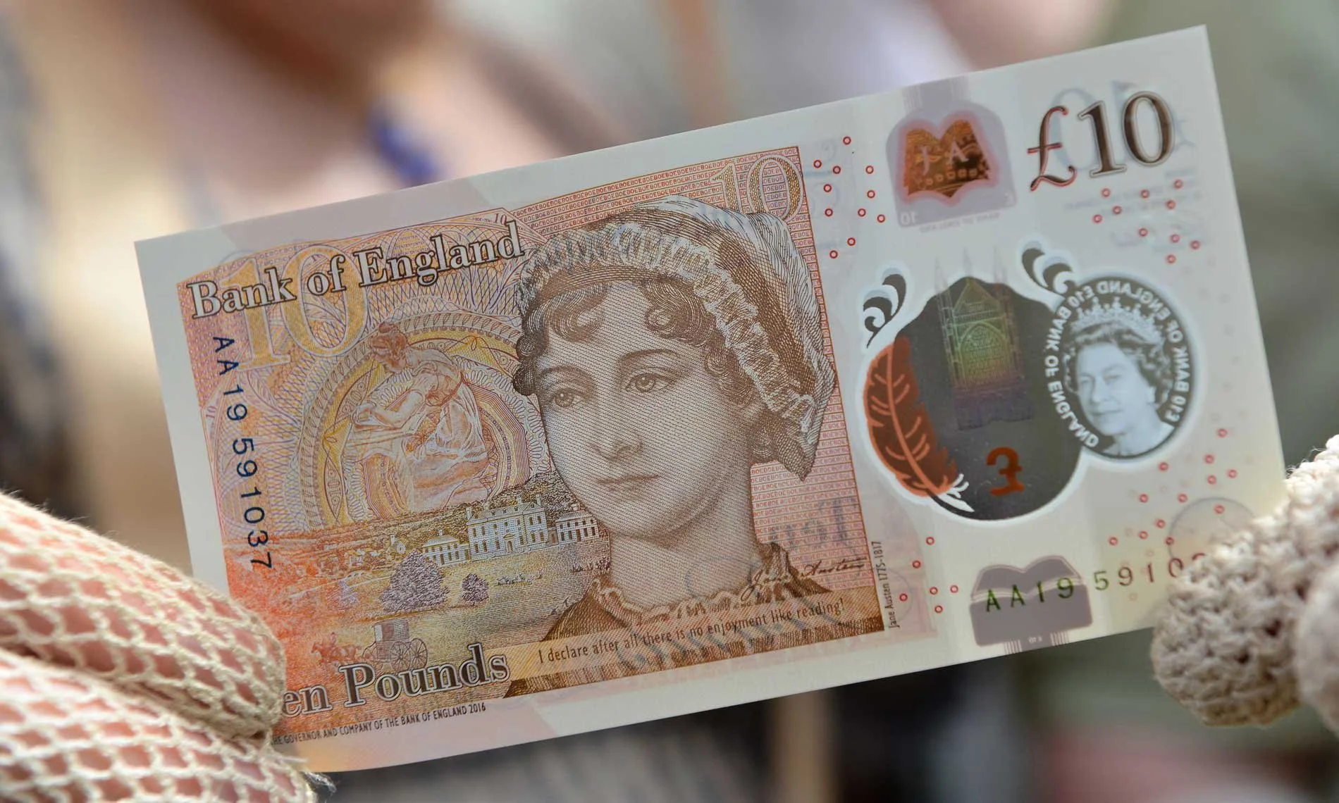
How to Make Your Birmingham Business Look Like a £10 Million Brand (on a £10 Budget)
Studio Notes from YST
Let’s get one thing straight: you don’t need deep pockets to look like you’ve got your act together.
We work with big brands and small independents — and we’ve seen firsthand that the perception of quality doesn’t always come down to budget. It comes down to clarity, confidence, and consistency.
So if you're a Brummie business trying to look the part without spending the earth, this one’s for you.
1. Stop using 47 different fonts
Every time you change fonts, a designer cries.
Pick two. One for headings. One for body copy. And stick to them like glue. You don’t need to overthink it — just make sure they’re clean, legible, and not Arial or Papyrus.
Try this:
Google Fonts are free. Use something like Inter or Archivo (we love Archivo). Looks pro, reads well, costs nothing.
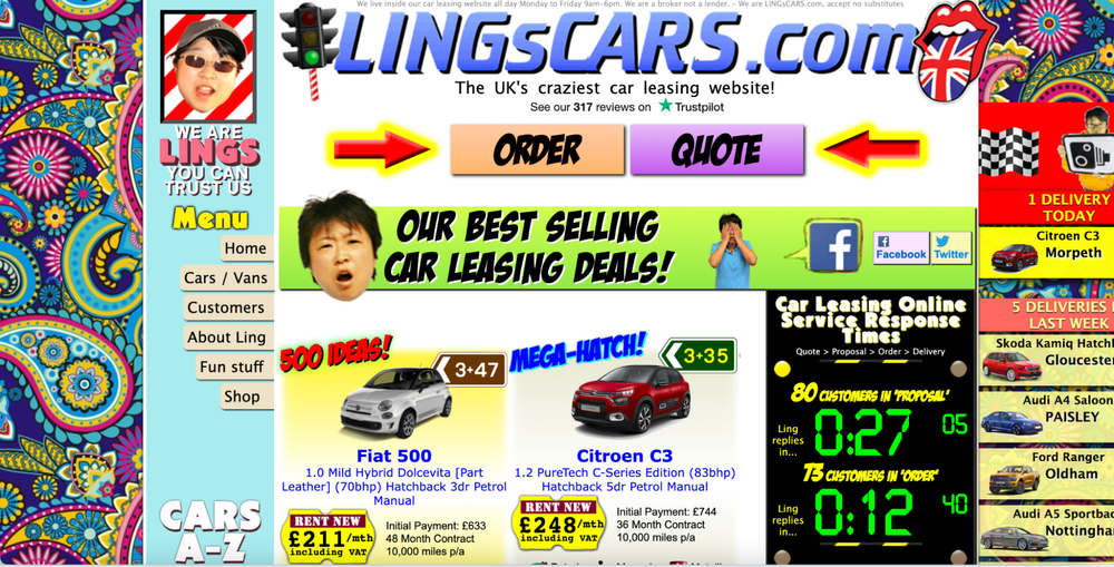
Source: https://www.lingscars.com/
2. Get yourself a colour palette and don’t mess with it
You don't need 15 shades of blue. Pick 3–5 colours that reflect your vibe and work across print and digital. No more, no less.
Try this:
Coolors.co is free and gives you ready-made palettes. Just don’t pick a pastel pink and mint green combo unless you’re opening a 2016 cupcake shop.
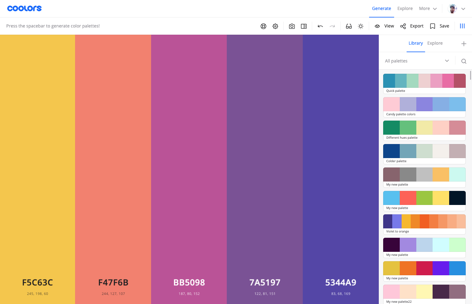
Source: https://coolors.co/
3. Use better photos (please)
Blurry images. Cropped heads. Stock photos with American money or fake smiles. We see it all the time.
Photography sets the tone faster than your words do. If it looks dodgy, people assume you’re dodgy.
Try this:
Shoot your own with a half-decent phone and natural light. Or use free libraries like Unsplash or Pexels - but stay away from the cheesy stuff.
4. Be consistent everywhere
Website says one thing. Instagram says another. Leaflet’s in a completely different tone of voice. It’s like walking into a shop and not knowing who’s in charge.
Try this:
Write three core messages about who you are and what you do. Use them everywhere. Make your bios, About page, posters, and signage sing the same tune.
5. Say less, better
You don’t need to shout every selling point at once. Keep your copy short, clear, and true.
Try this:
Instead of saying:
“We are a passionate, innovative, client-led, fully integrated, solutions-focused team with 25 years of experience…”
Try this:
“We help local businesses get noticed. Design, strategy, and creative that actually works.”
6. Have a logo that doesn’t make people squint
Your mate’s cousin might be lovely. But unless they understand design, layout, hierarchy, scale, and file types… they’re not a logo designer.
Try this:
If you’ve got no budget, just type your business name in your chosen font, space the letters well, and keep it clean. Done. Don’t overcomplicate it.
7. Don’t copy — curate
Don’t try to look like Apple. Don’t try to look like everyone else either. Find inspiration in unexpected places — packaging, film titles, signs on the Number 50 bus route. Then make it yours.
Try this:
Create a moodboard that feels like your business. Not what you think you should look like — what actually fits your energy. You’ll spot patterns.
8. Sound like a human
You don’t have to be formal to be taken seriously. Write how you talk. Be honest. People buy from people — even on a screen.
Try this:
Read your web copy out loud. If you wouldn’t say it to a real customer, don’t write it down.
You don’t need money. You need a point of view.
Looking expensive isn’t about gold foil and embossed logos. It’s about confidence. It's about knowing who you are and showing it properly, again and again.
And when you nail that — your £10 budget starts looking like £10 million.
Ready to upgrade your brand without breaking the bank?
Pop your details in below. We'll get in touch with real, honest ideas - no hard sell. Just what your business needs to look the part: